Maps with public data
NOTE: This information is out of date and the embedded maps which used to exist here are now static screenshots.
I’ve been having a great time working with public data and maps lately. The main reason that it has been so much fun revolves around the specific technology stack I am using to design and present them.
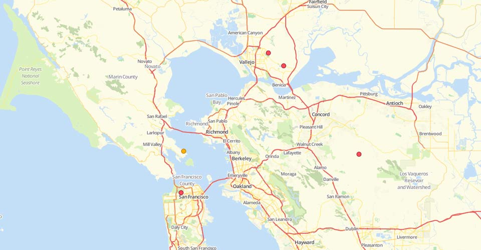
The above screenshot shows one example of a San Francisco Bay Area map that I’ve been gradually working on as part of some map related research into providing a geographical context into a specific set of past events which occurred in that area (sorry for the vagueness).
I’ve been able to quickly create and present some visually interesting maps which convey useful data on a range of subjects using technologies from MapBox such as TileMill, TileStream, and Wax.
Here is a brief overview of the MapBox solution, and some of the maps I have recently created with it.
Think globally, map locally
As you’ll see, the following maps all center around my local area, and since I’m just experimenting with the technology right now, these maps relate to random subjects, though I do strive to ensure some accuracy. Please tweet @brianshumate if you find any serious flaw, and I’ll do my best to fix it.
Longboarding spots in Boone, North Carolina
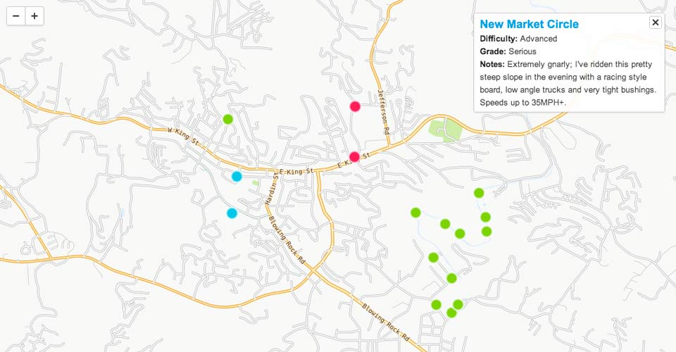
I made some nice maps with longboarding spots I like to ride in Boone, NC based on OpenStreetMap, so I thought I’d do something like that with the MapBox tools first.
I should note that what you see in the above map is not just a service that I am pointing to and dropping markers on. I designed this map using U.S. Census Bureau data combined with my own GeoJSON data and styling rules using TileMill to arrive at the look and feel it has, including the styling of land areas, roadways, water bodies, marker data, and legends.
The TileMill application is available for OS X or Linux. It has a nicely intuitive user interface and will quickly feel familiar to web folks.
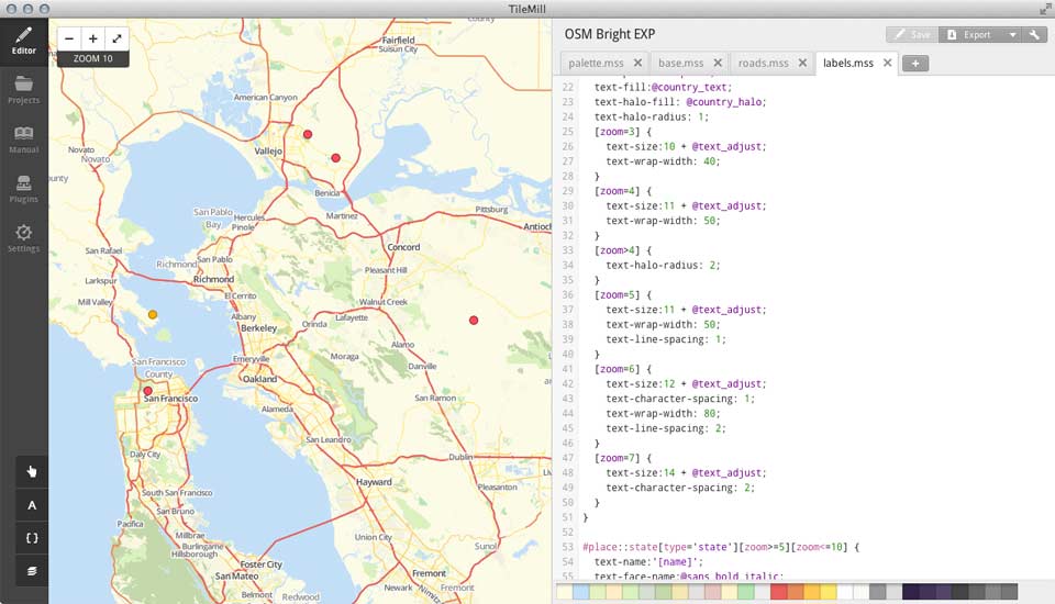
The TileMill app has a nice browser based user interface where you use the CSS-like language carto to define the styles for your map’s layers and data. TileMill also has a handy carto reference built in.
Carto is an advanced CSS like language with nesting, variables, and other cool features resembling those of CSS meta languages like LESS and SASS.
The MBTiles specification is an interesting new way to store map tile sets and their associated metadata in an SQLite database.
After designing the map in TileMill, I use its export features to generate a set of image tiles in a format (MBTiles that the TileStream tile server can serve up to any kind of web application or site imaginable. TileMill can also export your map creations as PNG or PDF images, too.
Finally, I use the Modest Maps and Wax libraries to stream the map tile sets from my TileStream server, and display them here as embedded interactive maps!
That is also putting it modestly, indeed; you can do some seriously cool things with this trio of technologies, and some solid JavaScript chops.
The Development Seed home page is a perfect example of the kinds of neat map visualizations one can create with these tools.
Terrain visualization
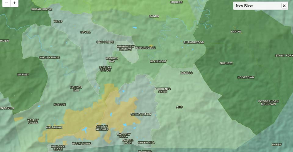
For creating the terrain visualization in the above map screenshot, I consulted MapBox documentation on using GDAL DEM utilities and STRM image data: Terrain visualization with digital elevation models and GDAL.
This simple map is a proof of concept, and uses only one interactive layer, the names of Watauga county communities (displayed on mouse over).
I learned quickly from making maps like this one, that the workflow is a serious craft requiring one balance a blend of design concerns like color theory against more nerdy pursuits, such as command line wrangling.
While I’m not a Cartographer, and I still have a lot to learn about map making, I am looking forward to building more visually interesting maps with these tools in the future.
The MapBox projects I mentioned in this post:
The documentation for MapBox tools is well written and uses nice examples. Further, the projects are all open source and accessible in the MapBox GitHub project.
Watauga County food service ratings
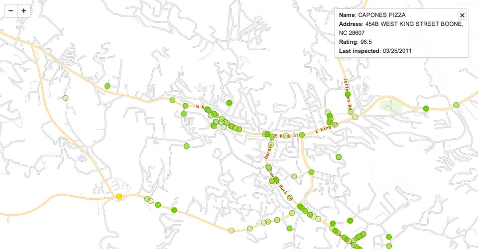
This map combines public health inspection data which I scraped and converted to GeoJSON for restaurants and other food service services with the restaurant locations color coded by rating.
You can hover over each point for the name of the location and the rating, and you can click to get a bit more information for a given location.
In summary
The data used for these maps comes from the following sources: 2009 TIGER/Line® Shapefiles, Watauga County Health Department, Shuttle Radar Topography Mission, and my phone’s GPS. :)
The MapBox stack is quality open source software with great attention to detail, and the folks behind it are responsive, helpful, and friendly.
I’m looking forward to making more awesome maps, and seeing where this solution goes.